Preferences allows you to change the properties for the whole report. Any
changes made to the preferences will be instantiated for newly created plots.
Note: This is different from changing the colors or properties for an individual graph.
Allows you to change the name of the form file that the report uses. Note that after you have generated graphs, tables and calculations based on a form, any form you associate with the report must have the same questions and field names from the original form.
Allows you to change the name of the database file associated with the report. Note that after you have generated graphs, tables and calculations based on a data file, any database file you associate with the report must have the same field names from the original database file.
Changes the orientation of all your report pages to either landscape or portrait.
Sets the default graph colors for reports generated using Analysis ![]() Plot.
Use Edit
Plot.
Use Edit ![]() Colors to change colors on individual graphs.
Colors to change colors on individual graphs.
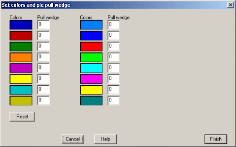
Each drop-down color box represents a bar in a bar plot. The colors are assorted
in order so that the first color in the list is associated with the first bar.
For pie plots only, this box can also be used to offset or pull the pie wedges
for better visualization. The value in the Pull wedge box next to its associated color
is a pixel value. This will offset the wedge by the specified pixel value.
Sets the default graph properties so that when new graphs are generated (using Analysis ![]() Plot)
they are displayed according to the options chosen here. Use Edit
Plot)
they are displayed according to the options chosen here. Use Edit ![]() Properties to change
properties on individual graphs.
Properties to change
properties on individual graphs.
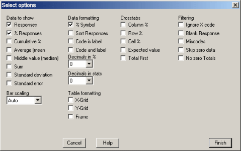
| Responses | Shows the number of records in the database that contain a response to the question being plotted. |
| Response % | The percentage of a particular reponse for a given question. Note: For "Check All That Apply" questions, the percentages shown will usually add up to more than 100%, since multiple responses can be selected. |
| Cumulative % | Counts cumulative percent, used in Pareto graphs. |
| Average | Calculates the average (mean) value, for weighted-score and write-in number questions. |
| Median | Displays the median response value for weighted-score questions. |
| Sum | Adds together all responses for write-in number questions. |
| Standard Deviation | Calculates the standard deviation for the responses to weighted-score and write-in number questions. This function uses the biased (divide by N) method of calculating a populations' standard deviation. This will give the same result as using the STDEV() function in Microsoft Excel. |
| Standard Error | Calculates the standard error for the responses to weighted-score and write-in-number questions. |
| % Symbol | When selected, numbers which are percentages are followed by the % sign. |
| Sort Responses | Sorts the responses in descending order. Used for Pareto graphs and in TQM. |
| Code is Label | Replaces the labels for the response with the actual code value stored in the database. |
| Code and Label | Shows both the label and the code value stored in the database. |
| Decimals in % | Sets the number of decimal points to show in percentages. The default is zero. If zero decimal places are used and if the value is above .5, the number is rounded to 1, while numbers .5 or below are rounded down to 0. |
| Decimals in Stats | Sets the number of decimal points to show in statistics. |
| X-Grid | Shows horizontal lines on a table. |
| Y-Grid | Shows vertical lines on a table. |
| Frame | Shows an outline frame on a table. |
| Column % | Shows the percentages for the column variable, row variable and for each cell. |
| Row % | |
| Cell % | |
| Expected Value | In a crosstab table, this calculates the percentage that you would expect if the answers to the questions were not related. If the actual value is significantly different from the expected value, then there is a statistically significant relationship between the groups. |
| Total First | Prints the total values in the first column and row of a table. |
| Ignore X code | Leaves out data that has a response code of X,Y or Z from the graph. |
| Blank Responses | Counts unanswered questions. |
| Miscodes | Shows the number of incorrectly answered questions. A miscode usually indicates an error in translating the form or a database error. |
| Skip Zero Data | Doesn't count zero in calculating averages. |
| No zero Totals | Shows every possible answer to a question, including those which nobody answered. |