Analysis Menu - Summary
Summary prints charts and tables of your database. When you choose this option from the menu, you will be able to decide on the appearance of the report. Select OK after you have made your choices, and EZSurvey will go through three processes: calculating your responses, drawing graphics, then displaying the charts.
- Have the survey file opened (see how to open EZSurvey project).
- Make sure the path to the database that stores the survey data is valid.
- Select Database
 View database to see if the records in the database are available or not. If the records are available, you can continue. If they are not, you may need to stop here and check to see if the survey data has been collected correctly or not. (see the topic File Property Database or Email Advanced email options or web site configuration setting)
- Select Analysis Summary. The summary setup window opens.
- Select tab: Data, Labels, Format and Appearance if you want to change the default settings. Select OK when you are done with the settings. The Drawing window opens and you can see the survey result in the graphic style.
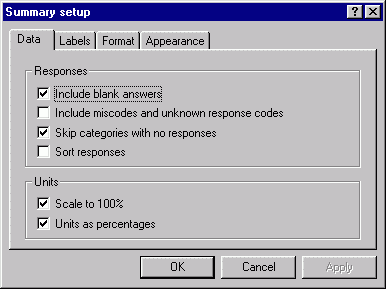
- On the Data tab, select whether to include blank responses, miscodes, and questions that nobody answered. Also choose the units on the chart axis.
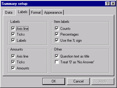
- On the Labels tab, select which items you want to appear as labels on the report.
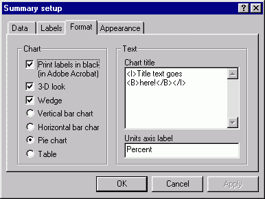
- On the Format tab, choose the graph appearance, and add title text.
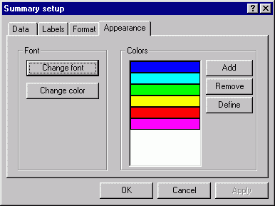
- On the Appearance tab, choose the font for the graph text, and the graph color.
- Save and close the Drawing window.
Note: If you save graphs to PDF files, use only the base fonts that come with Acrobat: Times, Helvetica, and Courier.
- To change the paper size, select File Printer setup from the Drawing window's menu before you generate the summary.
- To copy an individual graph to the clipboard, click on it with the mouse, then select Edit Copy from the menu.
When you use the graph browser window, you can use the following keyboard shortcuts:
+ Zoom in
- Zoom in
* More graphs per line
/ Fewer graphs per line
EZSurvey can produce summary graphics in many formats. Four tabs appear at the top. These are Data, Labels, Format and Appearance. Your options include:
Data:
Include Blank Answers
Check this box to count unanswered questions.
Include Miscodes and Unknown Response Codes
Check this box to count database errors and new response codes as a special category.
This will show you if there are any response codes in the database that aren't defined
in the form. Checking this option will also show unanswered questions as a special category.
Skip Categories With No Responses
If this is selected, categories which have never been used will be ignored. Of course, this will not apply to pie charts. If this is not selected, responses that nobody has ever selected will show up on your plots.
Sort Responses
This sorts the responses according to percentage. For bar charts, higher percentages are on the left and lower percentages are on the right. For pie charts, larger slices start on the right and rotate counterclockwise.
Scale to 100%
When checked, the graph is drawn from 0-100%. When unchecked, it is drawn from 0% to the highest response percentage.
Units as Percentages
When checked, the vertical axis is labeled with percentages. When unchecked, it is labeled with the number of responses.
Labels:
Labels/Amounts
Prints response text labels and/or percentage amounts next to the axis.
Axis Lines
Axis lines will not be drawn if this box is unchecked.
Ticks
For percentages, checking this box adds small ticks at 10% intervals along the axis. For responses, small ticks are added next to each response bar along the axis.
Counts
Checking this box will print the number of counts about each bar or next to each wedge.
It has no effect of tables.
Percentages
Checking this box will print the bar/wedge's percentage above it. For tables, it will print a second column of percentages.
Use the % Sign
If Percentages is checked, this option will print a percent sign after the percentage. It has no effect on tables.
Question Text as Title
When this option is checked, the question's text will be used as the title for that graph. If it is unchecked, the question's description will be used instead.
Treat '0' as 'No Answer'
Response codes of zero will appear in the chart as "Blank" responses, as if the respondent did not answer.
Format:
Print Labels in Black (in Adobe Acrobat)
Prints all labels in black in PDF (Adobe Acrobat) files. Otherwise, PDF files will have labels that are color-coded to match the category. Labels are always black when you view them in EZSurvey.
3-D Look
Draws the graph with a small amount of depth.
Wedge
Checking this option puts a small amount of space between bars or pie wedges.
Vertical Bar Chart/Horizontal Bar Chart/Pie Chart/Table
Lets you select what type of graph to draw. The default graph is a pie chart.
Chart Title
This text will appear at the top of every page. You can make text bold, italic, or underlined by placing it between the following tags:
Bold - <b>
Italic - <i>
Underline - <u>
The title can only be one line. Any lines entered after a return will be ignored.
Unit Axis Label
This text will appear next to the units axis. The default is Percentage
Appearance:
Change Font
This will allow you to change the font, size, and style of the summary font.
Change Color
This changes the font color.
Add
This will allow you to add a new color to the list of colors. The first color will be used to draw the first bar/wedge, the second color for the second bar/wedge, and so on. If there are too many bars/wedges, the default color of blue will be used.
Added colors appear on the end of the list.
Remove
This will delete the currently selected color from the list. It will do nothing if nothing
is selected.
Define
Define will bring up the Colors box and let you redefine a selected color.
See also...