Beginning Tutorial - Analysis
First, save your form and make sure you have some data already entered. If you haven't created a form, open the Quality.ezf template that comes with EZSurvey.
- Make sure that you have saved your form recently and that you have some data in your database. Select Analysis
 Sample Data if you need sample data.
- Select Analysis Summary from the menu. A dialog box will appear with a list of options.
- Select the Data tab from the top of the dialog box. Check the response options that you want to include in your summary:
- Include blank answers
- Counts unanswered responses in the summary.
- Include miscodes and unknown response codes
- Codes that are not one of the registered codes in the form are included as "miscodes".
- Skip categories with no responses
- Does not count empty responses.
- Sort responses
- Sorts the responses in alphabetical order.
- Select the style of units you want to use in your summaries:
- Scale to 100%
- Causes the scales for bar charts to always go to 100%, even if the maximum value in the chart is less than 100%.
- Units as percentages
- The units in the graph are displayed as percentages instead of response counts.
- Select the Labels tab at the top of the dialog box. Select which graphical options you want to display for bar charts.
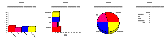
- Select the Format tab at the top of the dialog box. The options are Vertical bar chart, Horizontal bar chart, Pie chart, and Table.
- Check the 3-D look box if you want a 3-dimensional chart. For pie charts, you can also select Wedge if you want to pull out the pieces of the pie chart so that they stand out.
- To set your own font and colors, select the Appearance tab at the top of the dialog box. To change the color, click on the color you want, then select Define to change it. To add a new color to the palette, select Add.
- Click OK to finalize your settings. After a few moments, the charts will appear, one per page, in the Summary window.
- You can use the Zoom in and Zoom out commands from the View menu to change the size of the charts on the screen. To save these charts, select File Save as from the menu.
See also...